
Multi-Verse DS
Design System UI Kits
A comprehensive design system built to support multiple brands, light/dark modes, and responsive design across all devices.
Preview
Typography
Brand Colors
Alias Colors
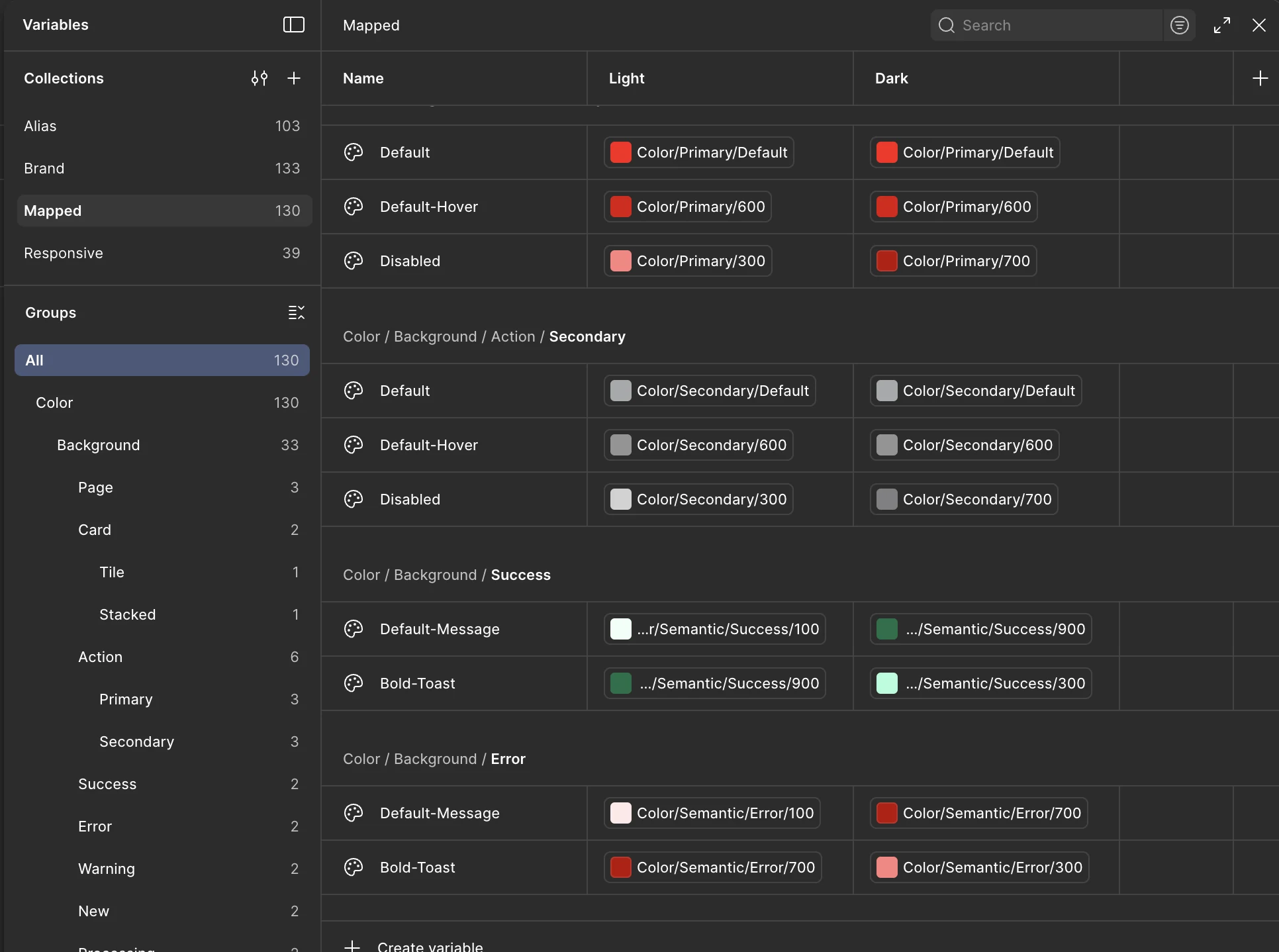
Mapped Colors
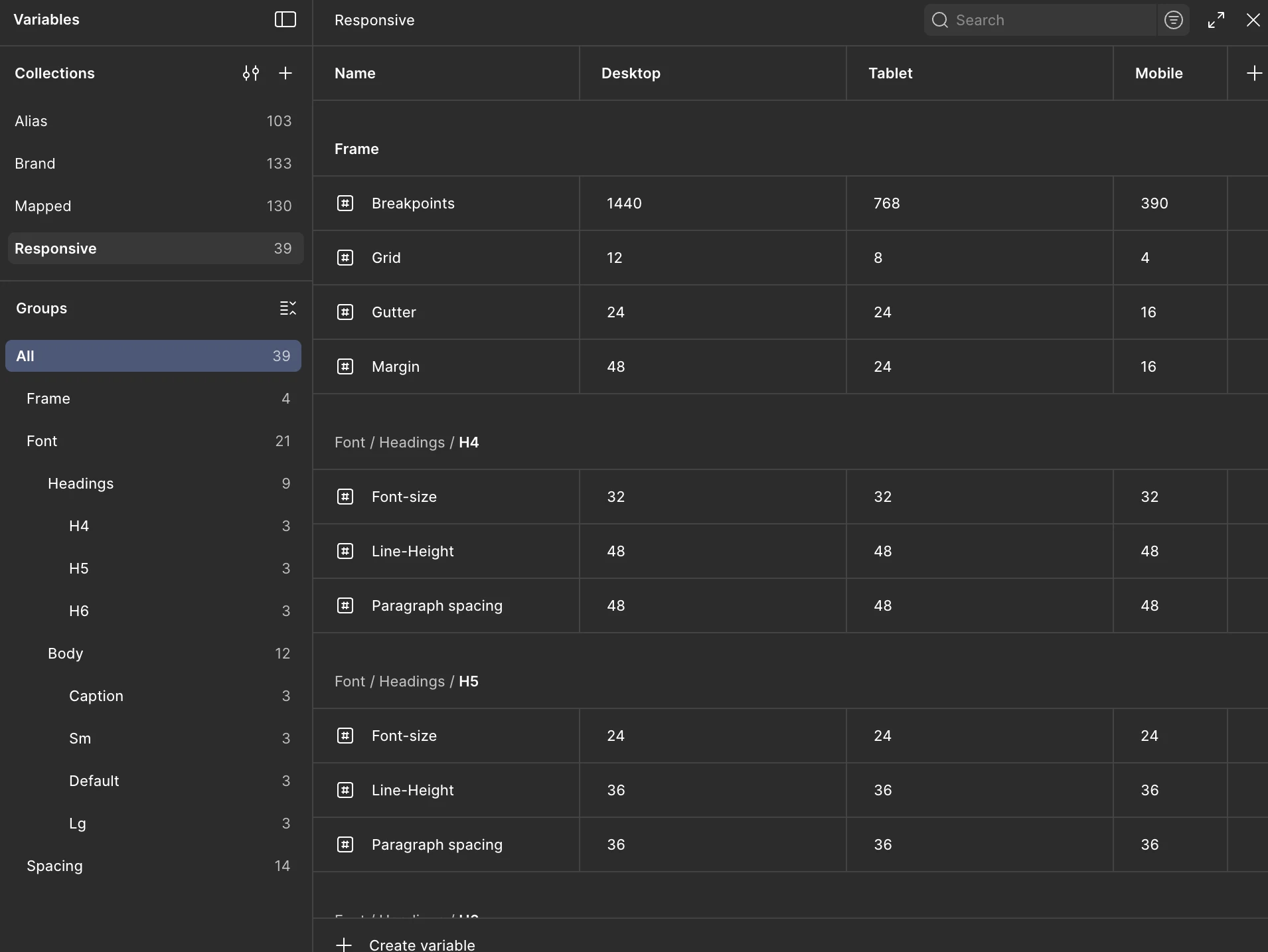
Responsive Tokens
Section 01
Overview
This project involved creating a scalable design system that could support multiple brand identities while maintaining consistency across different themes (light/dark modes) and device types (desktop, tablet, mobile).
The system includes comprehensive color palettes, typography scales, spacing systems, border radius tokens, and component libraries that adapt seamlessly across all variations.
Section 02
Key Features
Multi-Brand Support
Flexible color tokens and theming system that enables quick brand customization while maintaining design consistency.
Light & Dark Modes
Complete dual-theme support with semantic color tokens that automatically adapt to user preferences.
Multi-Device Ready
Responsive components and spacing systems optimized for desktop, tablet, and mobile experiences.
Section 03
Design Token Collections
The system is organized into four main collections that work together to create a flexible, scalable design system supporting multiple brands, modes, and devices.
Alias
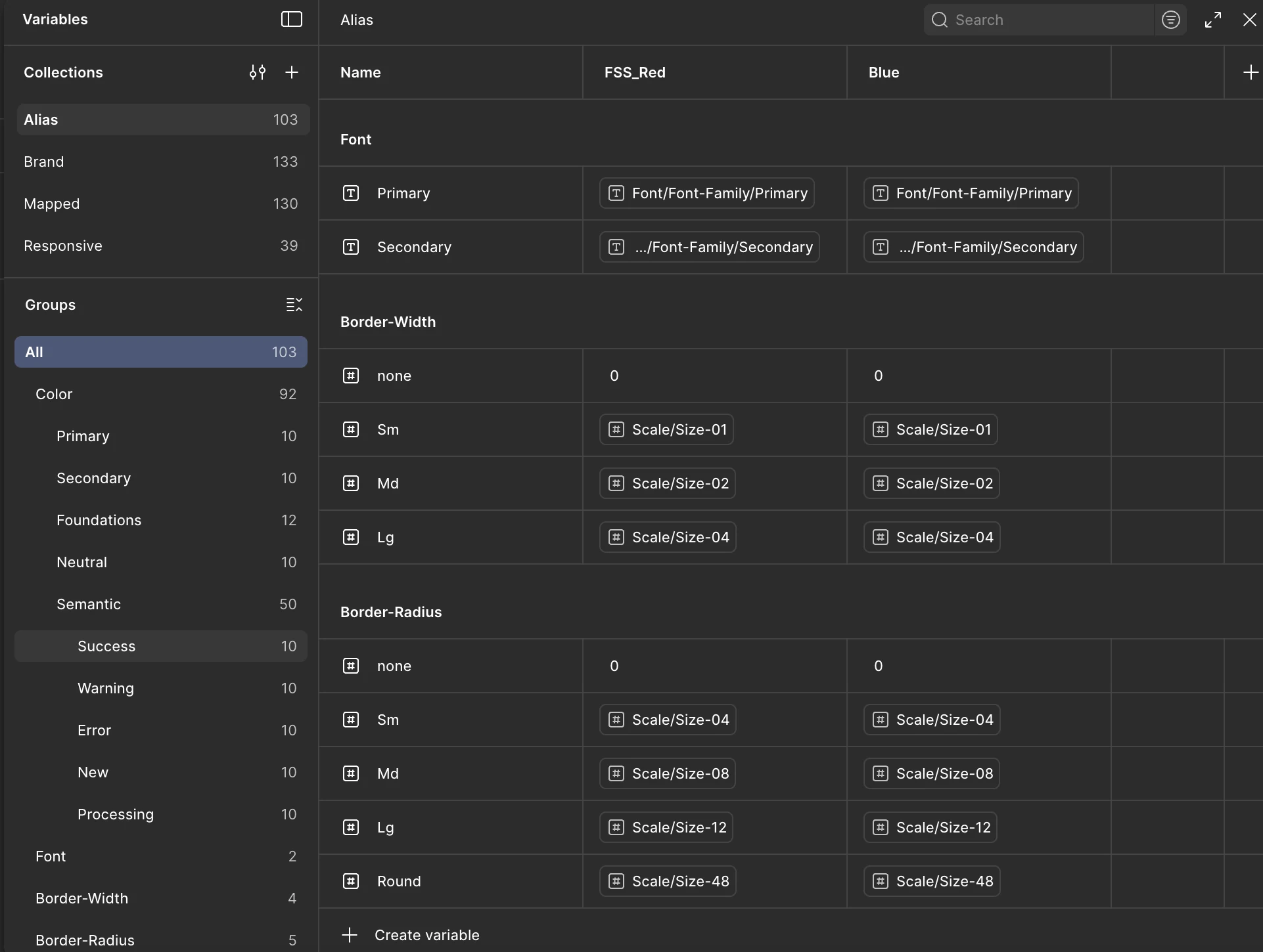
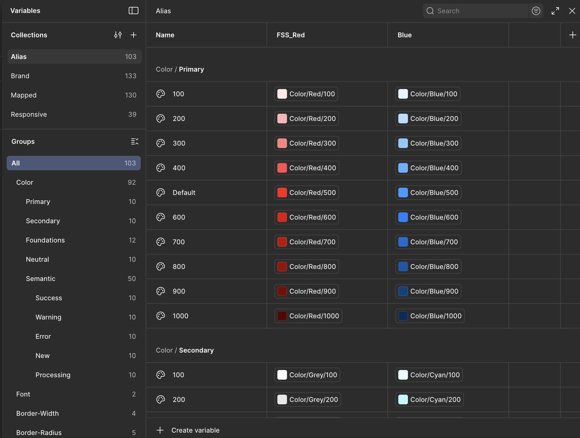
Base colors, Typography and Sizing - Foundation layer containing primitive design tokens that serve as the building blocks for the entire system.
Brand
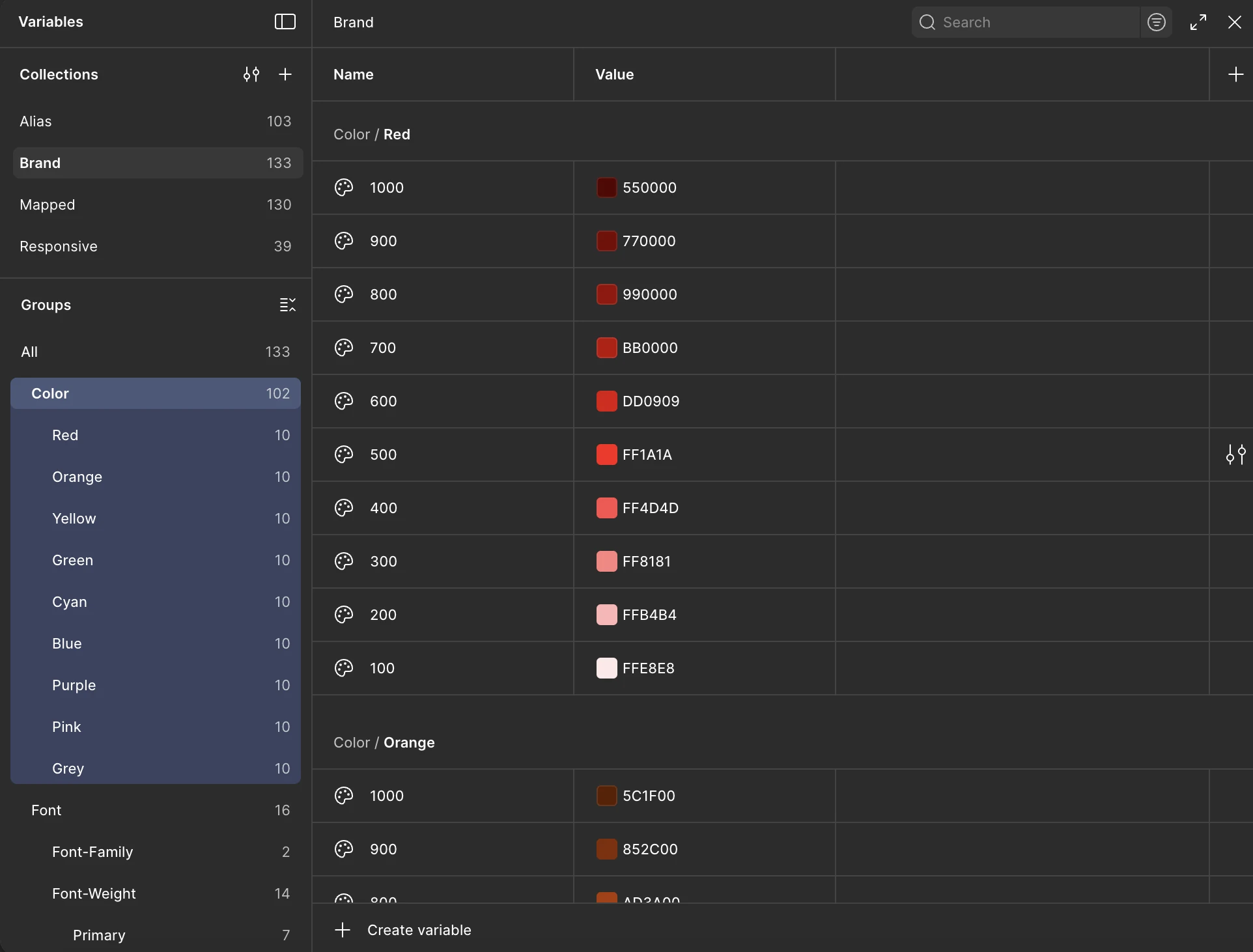
Define brand colors & Typography - Brand-specific tokens that reference alias tokens and define each brand's unique visual identity.
Mapped
Map the brand to respective UI elements with different modes - Semantic tokens that map brand definitions to specific UI components, supporting both light and dark modes.
Responsive
Structure, Typography and Styles supports Multi device compatibility - Responsive tokens ensuring consistent experiences across Desktop, Tablet, and Mobile devices.
Section 04
Implementation Approach
Token Architecture
- Global primitives for base values
- Semantic tokens for contextual usage
- Component-specific tokens for variations
- Mode-specific overrides for light/dark themes
Component Strategy
- Atomic design methodology for scalability
- Variant-based component architecture
- Responsive breakpoints for device adaptation
- Documentation with usage guidelines
Section 05
Impact & Results
Faster design to development handoff
Increase in design consistency across products
Brands successfully integrated into system
Section 06
Key Learnings
Scalability is Critical
Building a flexible token architecture from the start enables easier expansion to new brands and themes without major refactoring.
Documentation Drives Adoption
Clear documentation and usage guidelines are essential for team adoption and maintaining consistency across implementations.
Collaboration is Key
Close collaboration between design and development ensures tokens are practical and implementable across platforms.